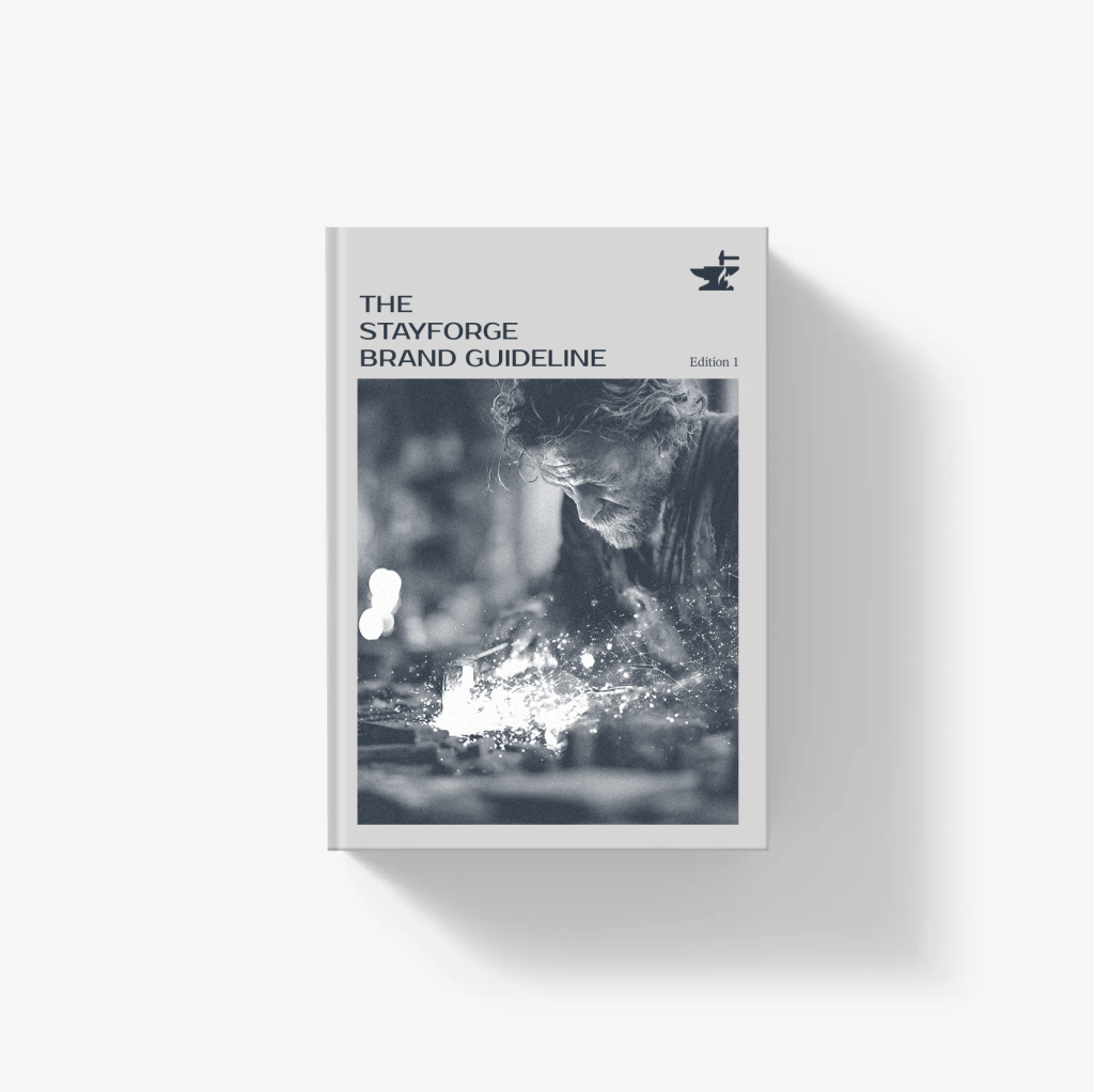
Brand Resources
Thanks for your interest in Stayforge. We have a few guidelines for correctly using our brand resources.
Primary logo
Our logo takes the shape of an anvil—symbolizing the strength, scalability, and creativity that define our services. It reflects our belief in craftsmanship and the mindset of shaping products with the care and precision of an artisan.
Logo mark
The Stayforge anvil mark may be used on its own, separate from the full logo. It is appropriate in contexts where the primary Stayforge logo has already appeared, or where the audience can clearly recognize the association with our brand. The anvil mark should never be incorporated into illustrations or decorative graphics. It is to be used solely as a direct representation of the Stayforge brand in communication materials.
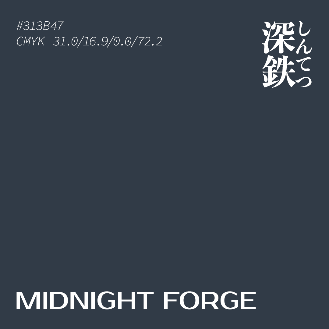
Primary Color
深鉄(しんてつ)
HEX #313B47
RGB R:49 G:59 B:71
CMYK C:31.0 M:16.9 Y:0.0 K:72.2
これは、夜明け前の工房にだけ残る、静かな影の色だ。炉はまだ眠り、鉄砧だけがかすかな光を返していた。
職人はまだ来ていない。風も動かない。今日かたちになるはずの思考や試みを、音もなく抱えたまま、そこにとどまっている。
Logo Typeface
The Stayforge logo uses Prosto One (Designed by Jovanny Lemonad, Pavel Emelyanov), a typeface available on Google Fonts. Its bold yet approachable forms convey both the reliability and warmth of our product. To ensure consistent brand expression, please follow this typeface design when using the logo.
Download media kit
Please don’t alter the Stayforge logo in any way